This was my first birthday. And those behind me and my brother were our grandparents.
My grandmother was accusing us of being “picky eaters”. Of course she was. She was born in 1923. In a time when you were actually lucky if you could eat everyday.
I was born in 1981. In a time of abundance and I was choosing what I wanted to eat (and mostly what I didn’t want).
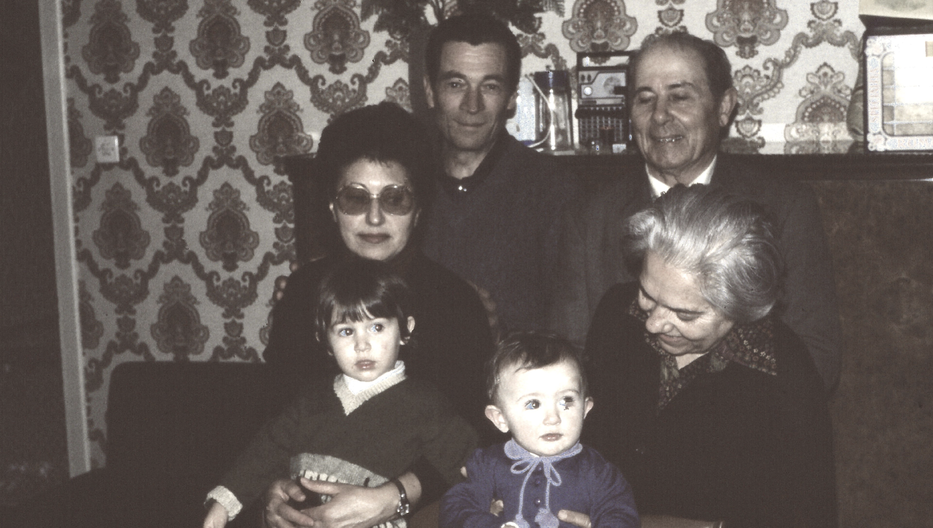
We were eating every lunch everyday at my grandmother place because my parents were both working.
She was challenged.
She took grand parenting and eating very very seriously.
Of course she didn’t choose to prepare us everything all together. This would be a disgrace. And a waste of food. A disgraceful waste of food.
She decided to get in the long time research. She began preparing small variation of the same meal and she was testing it with us. (At that time no, I didn’t know anything about A-B testing).
She remembered the results, even noticed it down when she realised she was getting older: my brother likes spicy food, I could not digest garlic, my uncle had some problem with mushrooms and my grandpa loved overcooked spaghetti.
Nowadays I cook for my kids and I always have leftovers. But at her place no. There were no leftovers.
She mastered it.
My grandmother died last January.
I didn’t realise what was she doing. She was from another generation and she saw the world changing. She adjusted and learned.
She took the challenge of feeding us with healthy food and made the best out of it.
She worked in silence and we barely noticed what she was doing. We just knew she was loving and caring. And we were all very happy to have lunch at her place and went back every day.
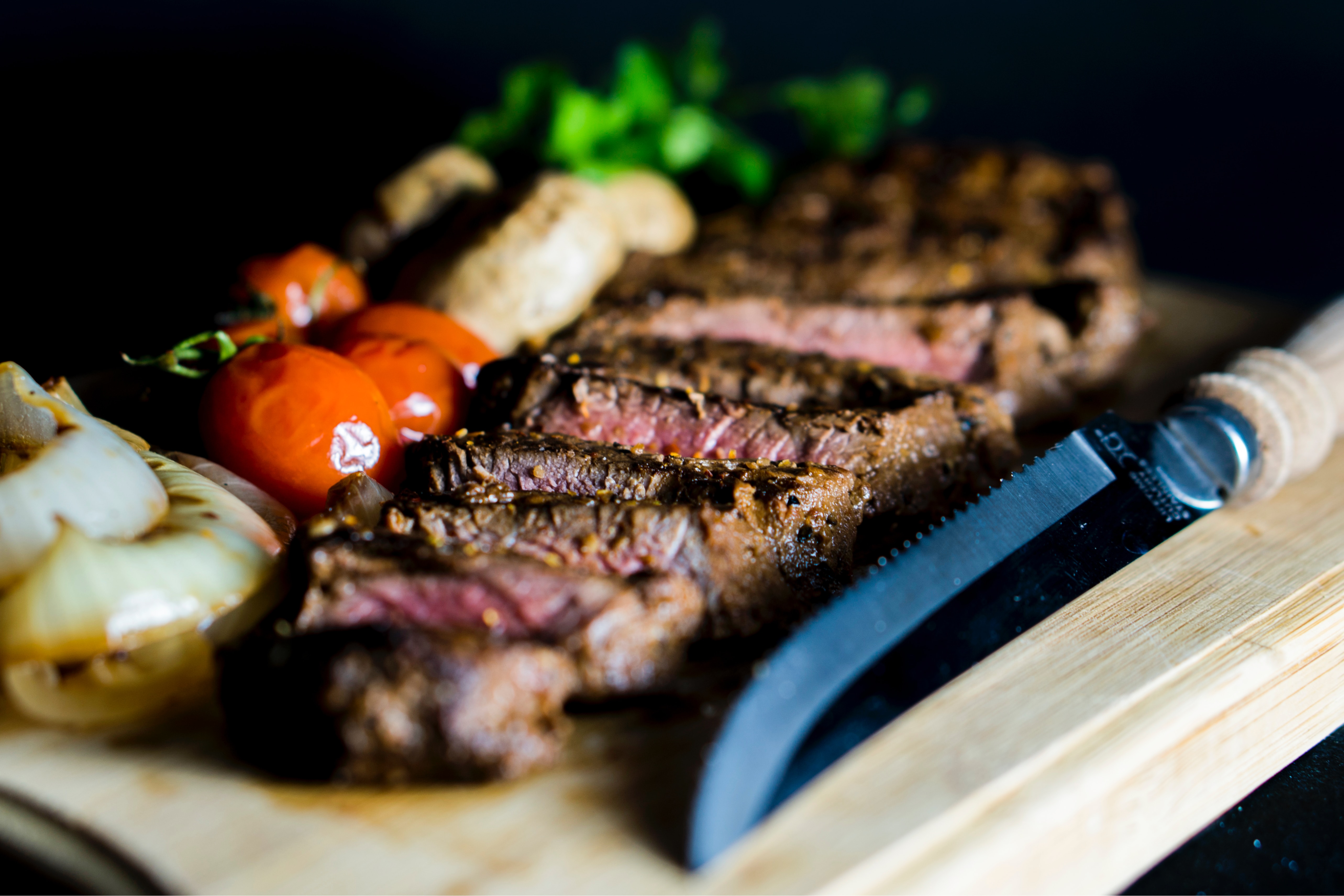
 Of course was not only for the food.
TYPO3 is an Open Source Enterprise Content Management System very well known in Germany. “CMS Crawler” detected around 384,000 installations by February 2017.
Imagine an evening after work, you are finally home, you put your keys in the door lock and open the door. It will take you around 3 seconds to understand all the tasks you need to do before you can sit down and call it a day. Dishwasher, washing machine, dinner, homework, cleaning the table, what is that? A message from my husband.
Let’s imagine we insert our username and password in the backend. It will open and the dashboard will offer us the overview. Is it everything working how it should? Do I need to do my daily tasks? Was somebody home before me? Do I have any messages?
The dashboard is a crucial feature to help being productive. The dashboard need to:
Ensure an overview of the situation
Offer a comparison of data
Offer shortcuts to a deeper visualisation
Let’s separate it specifically:
Project Goals: create a dashboard design and prototype based on best UX practices. We will provide the user with a starter kit. Widgets will be expanded by developers when publishing new extensions.
User Goals: save time and nerves offering an overview and avoiding the effort of searching for the different tasks in the backend. The function and the design must be self-explaining. The user should not learn something new but open and use it. Locate and understand the informations of greatest importance at first sight.
Business Goal: Customer engagement. The dashboard will help the user being more productive and better organised. Saving time and nerves will reflect an overall better user experience and increase the customer engagement.
Competitive Analysis:
As first part of my study I was trying to create an overview of the competition:
At a Glance. It provides a summery of the number of posts, pages and comments. They are displayed as link with a direct connection with the selected area. It tells you also which current version you have installed and which theme you are using.
Activity. This widget shows the upcoming scheduled posts, recently published posts, and the most recent comments on your posts–and allows you to moderate them.
Quick Draft. To create new content.
WordPress Events and News. Upcoming event near the user.
Welcome. The Welcome widget shows links for some of the most common tasks when setting up a new site.
A lot of the plugins you will add in your site will come with a Dashboard Widget.
Contra: the default dashboard widget cannot be disabled. The dashboard is a place to have the overview of the situation at first sight. Not allowing me to delete the widget I am not interested in, they are using crucial space and reducing other possibilities.
Joomla
Joomla comes with a series of dashboard that are accessible from the left list menu and content separated.
The main dashboard function as an overview. Here you can check the number of user and a direct link to the user administration page. The same with Menu Items, Articles, Categories and Update extension. More information about the active Theme, Latest Activities and SEO.
Using the navigation menu on the left of the screen we can access to other dashboard content specific:
User
Content
Settings
Menu Items
Menage Articles
Help (about community)
PRO: they reduced the number of tasks to a minimum and structured the dashboard to matter importance criteria. They use the first screen for the general overview and the following screens to a deeper overview of the specific tasks.
Drupal
Most of the times the Dashboard in Drupal contains menus, basic content or user statistics, a search form, content type admin tabs and a welcome message. It is possible to use custom modules to create the Dashboard page.
This means that Drupal lacks a unified Dashboard and every time the user goes back to a new backend it will look different from the previous one. In this case the user should count with a a high learning scale. It is so adjustable that there are no experts. It is the developer task to adjust it to the user and make the right decisions.
User survey
The importance of the right question
-What did you do today at school? — did anybody ever got a real answer to this question? Ever? So, even if this what we really want to know we should never ask it. We should search for a better question.
What I really need to understand here is which kind of widget do the user need.
But I realise I cannot ask that. If the user does not use a dashboard, he will not know what widgets are. If I need to explain that and then ask which one do you need, the answer cannot be trusted. The user will be only confused, he will feel he is loosing time and will give up. “I do not need something I didn’t need until now!” But actually they need it, only they still do not know it.
If I cannot ask about the widget, I need to ask about the tasks. If I can statistically organise typical tasks made on the backend I can create ad hoc widget to help that task to be realised.
The question I asked was:
What do you typically do on the backend?
I asked this question 2 times under a different formulation: One with a multiple choice to click for a better understanding of the meaning of the question. One with an open answer to better describe the task.
Based on all those information I created 3 personas:
Persona are made to better understand which kind of user will access the backend, to have a visualisation and a better undestanding for who we do all this work. I find those three are known enough and very suitable for our team. We know them, we know their usual key features, we can imagine why I used them for this purpose. I found this way of the visualisation much more fitting and effective than a fictive name.
Now that we know what we need to do, what the competence is doing and for who we do it we need to focus on how do we want to achieve our goal.
Love at first sight
We should not forget we want to change the overall experience the user will have opening the backend. How the dashboard looks it is a crucial point. The user should love the clear design at first sight (visceral reaction), he should understand it immediately (no demo) and should be pushed to try.
This “Love at first sight” will create expectations. Those expectations need to be trusted and fulfilled (behavioural reaction). The dashboard must work smoothly and the benefit of using it must occur quickly. We do not have much time to get the user “love us”. The user should love the design and understand that the appearance is only serving the functionality.
If the user needs to think on how to use our dashboard or need to understand and learn, we are lost. Time is a very big factor for the success of our tool.
We have been discussing about which design is the best to fit our needs. At the end we decided to use the TYPO3 organisation style guide. It uses a flat clean design with recognisable colours. This will be the basic dashboard variation. In best case there will be an easy customisable option to just adjust some colours to the Corporate Identity of the company the website is designed for.
On the top of the Style Guide I was setting some Design Criteria:
Red will be very scarcely used and only in case of danger or security matters. We wasn’t to avoid the blindness provoked from too many red elements on the screen.
The boxes or widget (that are not related to each other) will be separated by clear blank space.
No overdue or rainbow color. We will keep it simple. The design should serve the function.
No 3D effects.
Title text will be explicit: no abbreviation. Abbreviation must be remembered and are not immediately recognised.
Motion will be used only as supportive reaction to an action. We will avoid every movement that could distract the viewer and deconcentrate his work.
No scrolling inside a widget.
No vertical text.
No pie-charts (too complicated to remember in order to compare data).
The different widget will follow the Gestalt principle for the pattern and configuration. Proximity — Similarity — Continuity — Connection — Closure — Enclosure.
Additionally to the design I was collecting some basic functions we should have in mind when developing the UI:
The most important information or a summary of the dashboard should be on the upper left side of the screen. We are following the Z theory.
In the opposite position, on the lower right, we should find the place to add new widgets. We can create a plus button to symbolize the addition. After clicking on the button, this will open “accordion like” with several widget offer. This plus sign could also be posted inside the last placeholder widget. It will be an empty tab with a plus sign. Each of the new widget included in the accordion popup should have a recognisable icon (6 points) to symbolise the drag and drop function. In the best case we would have a placeholder appearing in the normal screen, to guide the user to drag the new widget in the right position.
The widget can be rearranged and reorganised by the user. We want the user to recognise the place, situation and meaning. It is much easier than recall and it will enhance the Generation effect — the recall of self-generated informations is greater than just the use of a good design.
Restrict number of short-term memory items.
It would be great to menage the dashboard “on the go”.
What about a TV display option? The dashboard could have a full screen function in order to display the status of the website/company on a big screen.
Widget list
A Dashboard without widget is no dashboard. I see the necessity to provide with three individual dashboard to choose from depending on the persona and their experience on the backend.
The user should still have the possibility to variate his opportunity adding new features. This option should be restricted to the first two personas, leaving the unexperienced Jar Jar out of the option. He should still be able to use the dashboard, but the adjusting option should be given to an editor with more experience.
The core features in most of the dashboards for freecodecamp are:
Tables
Notifications
Tasks Lists
Cards (for different type of forms and easier visualisation of the information)
Charts ( line chart, bar chart)
Google Maps
I was creating a basic list of widget based on all the data collected:
Content overview: how many pages, News, Users…
Recent Items: recently modified items and pages by owner.
System Status:central hub for monitoring health.
Welcome: Useful links or tutorials to “get started”
My husband called me the other day: “Irene, stay calm…” he told me. It took me around 2 seconds to have my bag ready and to leave my office with a checked heartbeat of 170.
I probably should specify that we have three small kids and that we are trying to find this parenting/working special balance.
So, my reaction was that of a worried mother. The phone call was unexpected and… why is there a reason to tell me to stay calm?
That reason you are hiding is already making me anxious.
Tell me the truth and tell it now!
The “keep calm” card.
When it comes to the things we really care (life, family, kids, money) we need to know what is going on.
And being afraid of loosing those things is a very natural behaviour.
The “keep calm” card is useless. Nobody can change or control this feelings anyway.
The only thing we are successful at when we tell somebody to “calm down” is to drive him crazy. We are grown up, not toddlers. My emotion have a reasons and they need to be there exactly for that reason.
Take me seriously!
Do not tell me what to do as if I would be a child and you are telling me to stop crying for some candies.
“Our kid knocked his head in the kindergarten and needs some stitches on his eyebrow” would have been the truth in this case.
I would have been scared to death. But those were the facts and I should find a way to cope with it.
I could have cried, I could have taken the car and run to the hospital, I could have told my husband to take care and I will try to come as soon as possible.
I would have known that it was not life threatening.
The decision how to react to those facts was up to me.
Fear is a process
We should know the facts and we should deal with them. But the decision must be ours.
We know that driving is dangerous, that computers get viruses, that smoking provokes cancer or that even when we are at home we have a lot of risks.
But we still find enough motivation to be here and to do it, no matter what.
Levels of fear and anxiety related to the unknown are very common.
Globally an estimated 284 million people experienced an anxiety disorder in 2017, making it the most prevalent mental health or neurodevelopmental disorder.
Looking at those high numbers I believe that we are a very positive thinking society.
Being afraid and recognise danger is not a bad thing. Without the capacity of reflecting on the events that could happen as result of ours or others action we (humans) would not be here at all.
Fear is based on learning from the past, analyse events that already happened and to elaborate our own “escape plan”.
Fear is sometimes there, sometimes is a process that needs years to be learned.
Some neuroscientists claim that humans are the most fearful creatures on the planet because of our ability to learn, think, and create fear in our minds.
This is the reason why little kids are crossing the streets without looking left or right. They still didn’t learn to analyse past experiences, even if from other people, and know that crossing the street without looking is dangerous.
Once we are old enough to understand the basics it is up to us to choose how to deal with the facts. There will be cases of kids running across the streets because they believe that they are faster than the cars and there will be those that will never cross the street without any help.
We are different.
We can show our kids the best way to do it, but the final decision is up to them.
What about the digital world?
We know that the user is afraid of giving personal information over the internet.
The common user is afraid of the internet and there are good reasons for it:
The internet is the unknown and full of bad stories.
Should we stop selling our product online or should we just believe and have fun until it lasts?
Of course we will still sell our product online ignoring the risks. But, how can we reassure our user that our website is secure?
1- Never tell them to stay calm or to trust you. Only the assumption that I should worry make me worry. So don’t.
2- Tell the truth: If the user is waiting you should tell them why are they waiting. If the search need time to find an answer through the database, if you need to verify the user’s data with the bank and back, whatever you are doing tell the user what is going on. Waiting times are extenuating.
3- Give the user enough motivation to take the chance and risk. Every user nowadays is aware that buying online has risks. You need to remind them every good thing in life is scary at the beginning. That it is normal to be afraid for the things they care. And that your product is worth. Jump and you will be rewarded.
4- Be funny. Making a situation funny is the best way to fight our fears. Is it not what happens also with Harry Potter and the Riddikulus?
The Commerzbank advertisement was turning to a joke the natural anxiety we feel regarding trusting somebody with our money.We are a bank. There are still some risks on giving us your money. But hey, we are German, and if there is something you could joke about the German it’s their disdain for surprises. And in the case of a bank this is just what I need. No surprises. No uncertainties. Just the truth. And you are a grown up. You are very aware of your risks. It is your decision to trust us, we are just giving you the right motivation to do so.
We do dangerous things everyday. From the moment we wake up till the moment we go to sleep. Risk belongs to life. And life is worth it.
I was lately looking Age of Ultron, Marvel. At the end it says referring to human kind:
“A thing isn’t beautiful because it lasts. It’s a privilege to be among them.”
Buying online is dangerous.
We know that.
Rapid fulfilment / wide offer / best prices / compare possibilities… all those, together with your great product, should give the user enough reasons to take the risk.
My husband bought a pair of William Painter sunglasses after getting in love with this advertisement:
I then showed the video in my office, I found it absolutely inspiring. We agreed on the geniality of the campaign behind the ad but I also got this link:
A pair of sunglasses with a hook to open a bottle for 7.29 dollars.
Building trust through quality
Of course the first difference I can state between the two sunglasses is the quality. We are willing to pay money for a product if we know that our money is worth it.
Of course in the ad they are over-exaggerating. The whole ad is an over-exaggeration. Is there such a thing as Aerospace Grade Titanium? I will not research on it and actually it does not matter.
The quality of the ad is already professional enough to let me believe they do care about the customer. It is like a well designed website. If the user has the impression that you care for them so much and you are willing to pay good money for a good website, they are already on the right path to believe that your product will be as much as professional as your website, or in this case advertisement.
The first statement of the ad is based on a common discussion. A lot of sunglasses on the market are just plastic. And you pay a lot of money for a design that do not give you the required amount of quality back. They are made of plastic and the brake. Or you loose it. Or someone steals it.
Reflective experience
Here we move to the second point of the campaign. We all have lived the annoying experience of loosing a pair of sunglasses. Everybody know that. But using those bad feeling to reassure the user that they will get a discount for a new pair is just right. You brake it? impossible. Do you remember? they are made of Aerospace Grade Titanium. They do not brake. You get a life warranty. They do not brake.
But your girlfriend could love them so much that she could take them.
They do not mention the fact that sunglasses are listed among the typical object you could find in a lost and found office. Because we loose them all the time.
And there comes the discount. They do not say: buy one and for the second pair you will get a discount. This would be a boring common marketing strategy. But they are cool. Under the apparent good offer of a discount they hide the feeling of desire. Like:
“It is not our fault if we make the best sunglasses in the world”
They are pushing on our REFLECTIVE emotion. Donald Norman in The design of everyday things divided the User Experience into three grade of feelings:
Visceral, Behavioural and Reflective.
While the Visceral represent a sort of love at the first sight and the Behavioural the good emotion we get using a tool that work the way we expected to or better, the Reflective grade is the most important one to get a user to love your product.
The reflective is the way the object is making us a new (and better) person. Is the way we can think of ourself, reflect our person in the eyes of of our friends and love the way they will look at us being the new us.
We make the best sunglasses in the world. Everybody wants our sunglasses. You will look amazing wearing our sunglasses.
Buy one of our sunglasses and you will be part of all the cool people “sense of community” wearing our sunglasses: the William Painter big family.
Dreams become real. Believe!
Another common argument of discussion is the added price we will pay to all the delivery and manufacturer involved in the process. Somebody will design it, somebody else produce, and somebody else deliver. Not counting the people involved in the marketing and all the people in between.
But this is a youtube advertisement.
Youtube (or the internet in general) is for excellence the free space where people with a dream can spread their voice and make things happen. They are not selling their sunglasses in a shop. Where they should pay a fee to the shop, send an amount of sunglasses all over the world in order to sell just a part of it.
No. They are dreamers. Like you and me. They have a dream and:
“The only way to do a thing is to do it”
Goosbump here:
Do not procrastinate. Do not take excuse for granted. Just believe in what you do and do it. Dreams are for great people. People who dare. People who believe.
Honour your ancestors…
…being innovative, fresh and young.
If there is a thing I learned about families is that thing about roots and wings.
The obviously fake roots of William Painter is a funny way of creating a family history behind a newly branded company. It is obviously fake. And funny. And still create a sense of ancestor and honour and history. In a funny way.
The fact that it is fake make the whole heavy luggage and negative emotions coming with elders taking part of the company just disappear. I mean. We all love our gran-mothers but it is difficult to listen to them as we did in the past, as if they would be the representation of our knowledge.
Behavioural Emotion
if you do not remember what it is just scroll a couple of paragraphs above.
Behavioural emotions are the one we feel using the perfect tool for the perfect purpose. Is the fulfilling good emotion we get from a pen smoothly dancing on a nice peace of paper, or from a sharp knife cutting through a medium cooked steak.
Nobody wants to cut the steak with a plastic knife. It does not feel right. Making the parallel with the sunglasses we get a sense of chalk scratching on the board touching our old plastic ones. (Or just thinking about them).
We are speaking about the marketing strategy about selling those sunglasses. The final focus of all our action is money.
And the first fear the customer has using or buying something online is also related to money. the fear of loosing it. The fact that people could access to our credit card and get to our account.
It is so easy!
Go to our website and buy them: “it is so easy”. they whisper in your/our ears. Is it really that easy?
People purchsing goods e-commerce online shopping
Let’s be honest. It is always easy nowadays. But if you begin to explain people how to buy your product online you are already supposing the difficulties people will have. And you should not. It is as easy as it is. There is no much need for explanation.
And nobody will steal your money. We are putting so much effort to create this bubble of trust in which you are right now. Do not be afraid. Believe. and just do it. did we said it already?
The take away
I see so many ingredient there that make the product appealing.
-Quality. -Reflective emotions. -Sense of belonging to a family. -There are no middle men or hidden costs. -Dream are for dreamers: Just do it! -Honour your ancestors. -They will not disappoint your expectations (Behavioural Emotions). -Buying it online is so easy you do not even need instructions.
Coolness as final ingredient
We should not forget the fact that the video is cool. Obviously and internationally cool. And it is just what sunglasses should be.
Yes, for me you can keep the 7 dollar sunglasses with a hook.
Sometimes I think I am doomed with my UX career. It is like when I studied Film history: I could not see any film anymore without making some sort of connection or analysis about what the director was doing there. No film looked the same after it.
This is exactly what is going on now with my life and UX.
This Saturday I went to an amusement park with my kids. We have been running and hiding and chasing and enjoying the walk through the wood. We stopped for a picnic on a bank and right next to us was a big box. It was perfectly fitting the height of my kids and had only one button in the middle.
My son went to the box and pressed the button:
For German press the button once, for English, press twice, for Dutch press three times.
The voice was in German and at the beginning I did not menage to hear the whole message. My kid was pressing the button again before the voice was finishing the sentence. And it started all over again.
Some other kids passing by were also pushing, listening a bit and going away.
I went to my kid and pushed the button once as soon as the voice was done with the instructions. The voice began to explain what to do in case of bees and hornists. All my three kids where now listening. And it was interesting.
We went on searching for other boxes and after several efforts my kids adjusted to the UI and were using the boxes in the right way. They were still annoyed. They had to hear the whole voice before getting to the important part.
The box
One button.
It was simplified to the absolute minimalism. There was no way of doing something wrong.
Where was stated that: “voice makes experience personal”. The article make a very good point taking into consideration the kid as an active player.
Behind this single Box there were a lot of interface thoughts. How to make it interesting, easy and useful for every kid. But in this case the voice was asking my kids to stand still and listen. Listen until the end.
It is already difficult for my kids to stand still and listen even in an easier environment. But there, in the middle of the wood and between physical activities, it was absolutely impossible.
The Challenge
So, going back to focus on the challenge I was seeing there: Three languages and one button.
Three language and a child-friendly user interface.
And we should not underestimate the factor time.
Those kids were bored because they got no direct information or result after pressing the button. They were in a rush. We must move faster than a good functional internet site. We have like 1 to 2 second to grab their attention.
Could there be a better solution?
Kids cannot read. I mean, my older one can, she is eight. But she would never find the calm for actively reading in such a situation.
The other two are still too young. But they were exactly the target age and group for the story behind the interface.
And this was not my case. I need to identify languages. And make it easy for no-reading kids to understand.
The Solution
I have to think of my kids and their behaviour every time they interact with an interface. They push all the buttons. All of them. Without any reason apart from curiosity.
Why not have three buttons instead?
They will try to push all of them. Understand only the voice they are targeted to and listen directly to the interesting story.
Pushing every time three buttons until getting to the right one will on the long way will be result in too much effort.
On the top of it there should be the written language: German, English, Dutch. In original language.
Kids will not be able to read it. But they will push the button. And after the second or third time they will push the button with the same words on it and they will or will not learn something. It is not important. They will just learn it by repeating the same actions and errors. Learning by doing, the best strategy where most of the kids excell.
I usually begin my presentations with an icebreaker I start with Jim as a little kid
Jim was having fun. He turned the light off and on. And off and on again. It was real magic. Just pressing a button on the wall he could make something happen. Something as beautiful as light. He probably needed to be sure he was not dreaming or wanted to drive his parents crazy. Fact is that he tried and tried again.
But Jim is not a kid anymore. He forgot how fun it was to turn off and on the light.
Nowadays, when he turn off the light is because he wants to sleep. If he turn it on again he probably needs to wake up or read something. He does it with a purpose. He even forgot the switch. Until…
Until that same light does not turn on. Jim is uncertain at the beginning. Is it a temporary problem? Did I pushed strongly enough? Let me try again! After a first feeling of uncertainty, he will experience anger. He need to call the electricians, he need to spend money and time on something he does not want. It is just a light! It should work!
Jim is in the middle of a relationship. The relationship between him and the switcher. And the first thing we build in a relationship, the very first things that provokes so many diverses is just there: THE EXPECTATION.
We push the button and we expect the light to turn on. It does not work, we feel disappointed. Why? We really need that light right now! How could it do that to me?
During this summer I was flying to my home country (Italy) as every year, to visit my family and enjoying the sun. One evening my kids and I were trying to cross the street and we had to wait five minutes until somebody was finally letting us going to the other side. And I was thankful.
When you do not expect for somebody to stop or better, when you are expecting nobody to stop, you will be thankful with the one being kind enough to let you use your right.
“How kind of him!”
But let’s be serious. I live since more than 15 years in Germany and I know my rights. I know that if I stop in front of a crossing street sign the auto has to stop. This is the law. Pedestrian are number one. Cars have to wait. Try to drive a car and not to stop it in front of a pedestrian crossing the street in Germany. There will be people taking your number plate and more that one advising your behaviour to the police. And those people will get very angry. I do get very angry at people not giving me my right here in Germany.
Than: why am I thankful in Italy for the only one who let me cross the street and get angry when somebody stops to late (but still let me pass) here in Germany?
Homo-Adaptatio
We human are made for adapting. It is sometimes difficult to believe (when I have to show my grandmother how to use a new app) but we as human being are made flexible and ready to adapt. As kids we adapt to our body constantly growing, we adapt to new friend at school, to new colleagues, to new situations. Not always at the same speed and not everybody with the same enthusiasm, but definitely we are made for it.
I do remember having a Nokia mobile Phone and not being able to surf the internet with it. I did not have the necessity back then, and the internet was still something for nerds. But I also remember my first iphone. The first time I searched for information on my way to work. The first time I navigate with a gps google map to the place we were supposed to meet. If I now compare it to the fact that I will change website if it does not open during the first 3 seconds I could believe I am going crazy. I believe I will not be able to get to my own house sometimes without a navigator telling me where to drive.
I have adjusted to the new technology. So much that I give it for granted. Yes, I will have internet everywhere I go. Yes, I can communicate with my mother even from the other side of the world. Yes, I will push the switch and the light goes on.
How can we make the better out of this?
Focus on the needs
We need to understand our target group. We need to write hobbies, family situation and works of our typical user. Without knowing our customer we cannot understand his needs and his expectations.
Once we understood for who we do the job, we should put ourself in his shoes and understand why they visit our website. For as much as we like telling the user about our history we should understand that this will not be the main reason the user will visit our website.
It is crazy but there are still examples out there of websites selling a service or a product only on the second or third page. If you have a product with a good marketing concept people will come to your website and buy it. It is so easy. Everything in between, every information you believe should find its place before letting the customer buy your product is in the wrong place.
It is in the customer interest and normal behaviour to find additional information to the product. But the option to buy it should be the first. The rest is, as said, additional.
Let’s imagine to be in the middle of the night. Everything is very dark and we hear some noises. We want to turn on the light and instead of the switcher we find a post-it note telling us about the history of the light and how cool and highly intelligent our engineers are. Or we push the switcher and instead of seeing the light a voice begin explaining us about the best way to produce green light and Kilometer 0.
Do not let me take away your imagination too much. You know what kind of reaction you would have.
Why do you do that to your customer?
Fulfilment is contagious
Great Expectations are for dreamers. It’s not by case that Charles Dickens “Great Expectation” is ranked as the 4th British novel of all times. A poor boy trying to change his life. “The pursuit of happiness” or lately “A star is born” or even ” The queen”, all prised stories following the same plot: daring is worth and never stop dreaming. Why do we love those movies? Because they let us believe that one day it could happen to us.
Now, there is a huge difference between being satisfied because the light goes smoothly on when we push the switcher and becoming a star.
Do you remember the young Jim? The one who loved driving his parents crazy and was fascinated by the magic of electricity? I began my presentation with him only to come back now and remember that there is a little kid in all of us and we all loved enjoying and having fun turning on and off the light. In this simple switch you can summarise all UX theories.
In this case we should also remember that we are all dreamers expecting something. For nature.