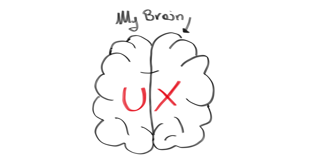
Overview
Sometimes I think I am doomed with my UX career. It is like when I studied Film history: I could not see any film anymore without making some sort of connection or analysis about what the director was doing there. No film looked the same after it.
This is exactly what is going on now with my life and UX.
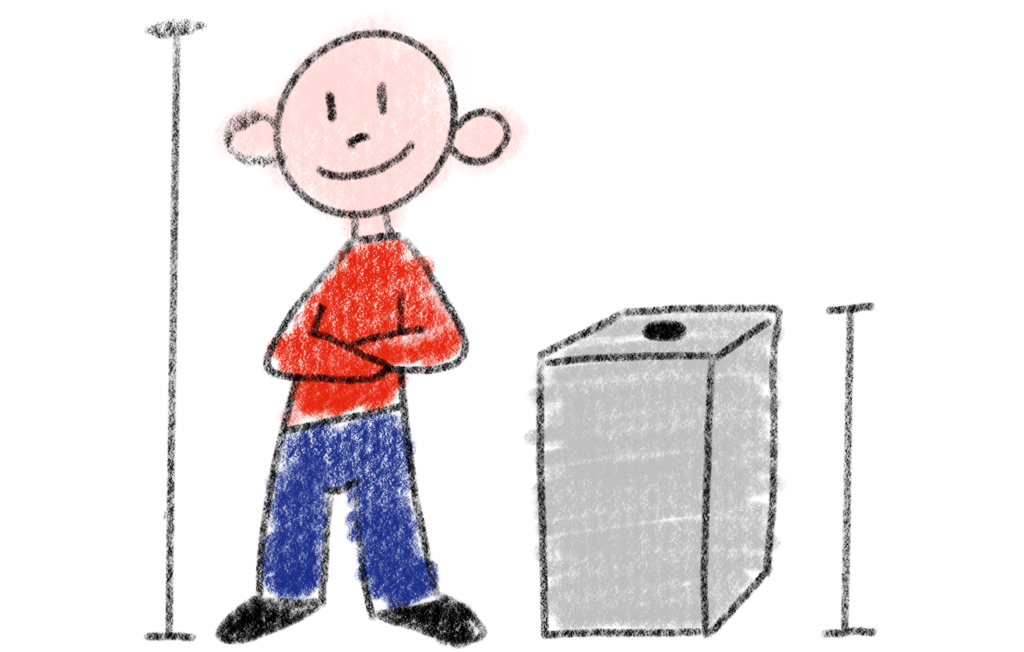
This Saturday I went to an amusement park with my kids. We have been running and hiding and chasing and enjoying the walk through the wood. We stopped for a picnic on a bank and right next to us was a big box. It was perfectly fitting the height of my kids and had only one button in the middle.
My son went to the box and pressed the button:
- For German press the button once, for English, press twice, for Dutch press three times.
The voice was in German and at the beginning I did not menage to hear the whole message. My kid was pressing the button again before the voice was finishing the sentence. And it started all over again.
Some other kids passing by were also pushing, listening a bit and going away.
I went to my kid and pushed the button once as soon as the voice was done with the instructions. The voice began to explain what to do in case of bees and hornists. All my three kids where now listening. And it was interesting.
We went on searching for other boxes and after several efforts my kids adjusted to the UI and were using the boxes in the right way. They were still annoyed. They had to hear the whole voice before getting to the important part.
The box
One button.
It was simplified to the absolute minimalism. There was no way of doing something wrong.
I recently red this article
Where was stated that: “voice makes experience personal”.
The article make a very good point taking into consideration the kid as an active player.
Behind this single Box there were a lot of interface thoughts. How to make it interesting, easy and useful for every kid. But in this case the voice was asking my kids to stand still and listen. Listen until the end.
It is already difficult for my kids to stand still and listen even in an easier environment. But there, in the middle of the wood and between physical activities, it was absolutely impossible.
The Challenge
So, going back to focus on the challenge I was seeing there: Three languages and one button.
Three language and a child-friendly user interface.
And we should not underestimate the factor time.

Those kids were bored because they got no direct information or result after pressing the button. They were in a rush. We must move faster than a good functional internet site. We have like 1 to 2 second to grab their attention.
Could there be a better solution?
Kids cannot read. I mean, my older one can, she is eight. But she would never find the calm for actively reading in such a situation.
The other two are still too young. But they were exactly the target age and group for the story behind the interface.
Of course the first solution we all come to think now is the flag one. But we also know that Identifying languages with flags is generally a bad idea. Flags can come in handy when selecting countries instead of languages.
And this was not my case. I need to identify languages. And make it easy for no-reading kids to understand.
The Solution
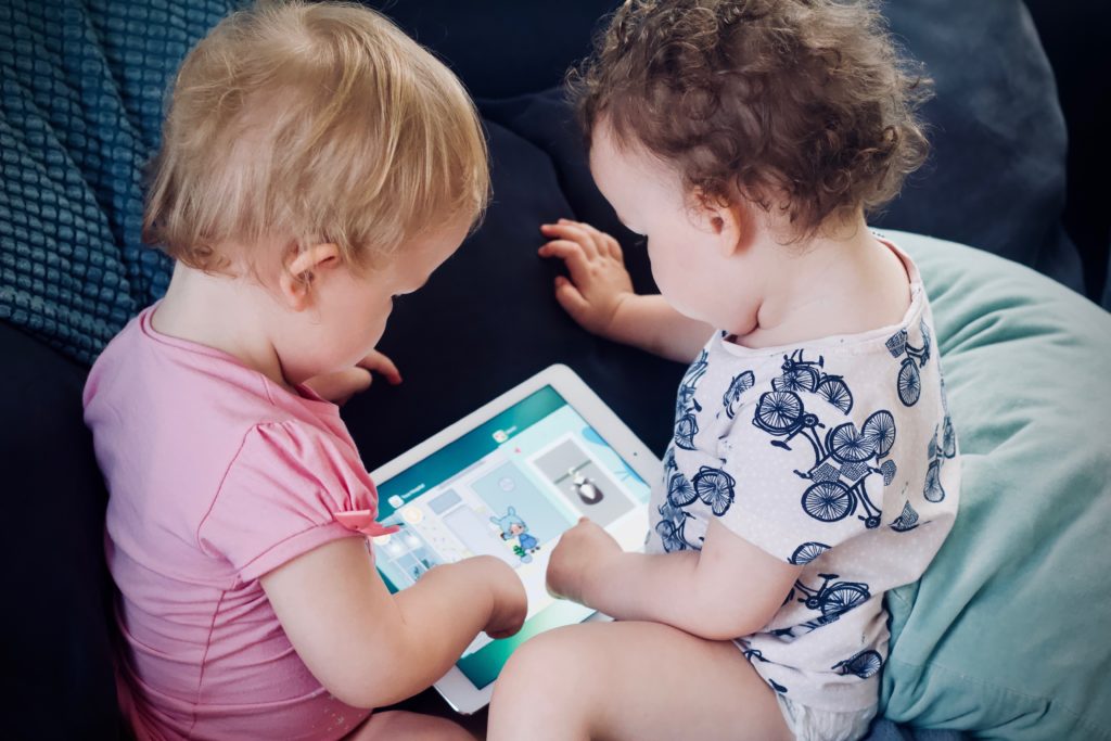
I have to think of my kids and their behaviour every time they interact with an interface. They push all the buttons. All of them. Without any reason apart from curiosity.
Why not have three buttons instead?
They will try to push all of them. Understand only the voice they are targeted to and listen directly to the interesting story.
Pushing every time three buttons until getting to the right one will on the long way will be result in too much effort.
On the top of it there should be the written language: German, English, Dutch. In original language.
Kids will not be able to read it. But they will push the button. And after the second or third time they will push the button with the same words on it and they will or will not learn something. It is not important. They will just learn it by repeating the same actions and errors. Learning by doing, the best strategy where most of the kids excell.
Children will play to find easily what they are looking for. They don’t like to search like adults instead of just clicking https://medium.com/@uxart/before-designing-web-ui-for-children-c302c6072269.
The take away
Yes, thinking interfaces for kids is not a game. It is challenging. And sometimes the easiest solution, one button, is not the best one.
Let the kids experiment, being curious and pushing buttons.
User interface for kids more info
This Article was published on Medium