A solution for productivity and customer engagement on a CMS — a UX case study
This article was published in UX Collective

About TYPO3
TYPO3 is an Open Source Enterprise Content Management System very well known in Germany. “CMS Crawler” detected around 384,000 installations by February 2017.
I am working with the Dashboard initiative team in order to implement a Dashboard: https://typo3.org/community/teams/typo3-development/initiatives/typo3-dashboard-initiative/

About the dashboard
Imagine an evening after work, you are finally home, you put your keys in the door lock and open the door. It will take you around 3 seconds to understand all the tasks you need to do before you can sit down and call it a day. Dishwasher, washing machine, dinner, homework, cleaning the table, what is that? A message from my husband.
Let’s imagine we insert our username and password in the backend. It will open and the dashboard will offer us the overview. Is it everything working how it should? Do I need to do my daily tasks? Was somebody home before me? Do I have any messages?

Goals
The dashboard is a crucial feature to help being productive.
The dashboard need to:
- Ensure an overview of the situation
- Offer a comparison of data
- Offer shortcuts to a deeper visualisation
Let’s separate it specifically:
Project Goals: create a dashboard design and prototype based on best UX practices. We will provide the user with a starter kit. Widgets will be expanded by developers when publishing new extensions.
User Goals: save time and nerves offering an overview and avoiding the effort of searching for the different tasks in the backend. The function and the design must be self-explaining. The user should not learn something new but open and use it. Locate and understand the informations of greatest importance at first sight.
Business Goal: Customer engagement. The dashboard will help the user being more productive and better organised. Saving time and nerves will reflect an overall better user experience and increase the customer engagement.
Competitive Analysis:
As first part of my study I was trying to create an overview of the competition:
WordPress

WordPress comes with a very basic Default Dashboard. It includes:
- At a Glance. It provides a summery of the number of posts, pages and comments. They are displayed as link with a direct connection with the selected area. It tells you also which current version you have installed and which theme you are using.
- Activity. This widget shows the upcoming scheduled posts, recently published posts, and the most recent comments on your posts–and allows you to moderate them.
- Quick Draft. To create new content.
- WordPress Events and News. Upcoming event near the user.
- Welcome. The Welcome widget shows links for some of the most common tasks when setting up a new site.
A lot of the plugins you will add in your site will come with a Dashboard Widget.
Contra: the default dashboard widget cannot be disabled. The dashboard is a place to have the overview of the situation at first sight. Not allowing me to delete the widget I am not interested in, they are using crucial space and reducing other possibilities.
Joomla

Joomla comes with a series of dashboard that are accessible from the left list menu and content separated.
The main dashboard function as an overview. Here you can check the number of user and a direct link to the user administration page. The same with Menu Items, Articles, Categories and Update extension. More information about the active Theme, Latest Activities and SEO.
Using the navigation menu on the left of the screen we can access to other dashboard content specific:
- User
- Content
- Settings
- Menu Items
- Menage Articles
- Help (about community)
PRO: they reduced the number of tasks to a minimum and structured the dashboard to matter importance criteria. They use the first screen for the general overview and the following screens to a deeper overview of the specific tasks.
Drupal

Most of the times the Dashboard in Drupal contains menus, basic content or user statistics, a search form, content type admin tabs and a welcome message. It is possible to use custom modules to create the Dashboard page.
This means that Drupal lacks a unified Dashboard and every time the user goes back to a new backend it will look different from the previous one. In this case the user should count with a a high learning scale. It is so adjustable that there are no experts. It is the developer task to adjust it to the user and make the right decisions.
User survey
The importance of the right question
-What did you do today at school? — did anybody ever got a real answer to this question? Ever? So, even if this what we really want to know we should never ask it. We should search for a better question.
What I really need to understand here is which kind of widget do the user need.
But I realise I cannot ask that. If the user does not use a dashboard, he will not know what widgets are. If I need to explain that and then ask which one do you need, the answer cannot be trusted. The user will be only confused, he will feel he is loosing time and will give up. “I do not need something I didn’t need until now!” But actually they need it, only they still do not know it.
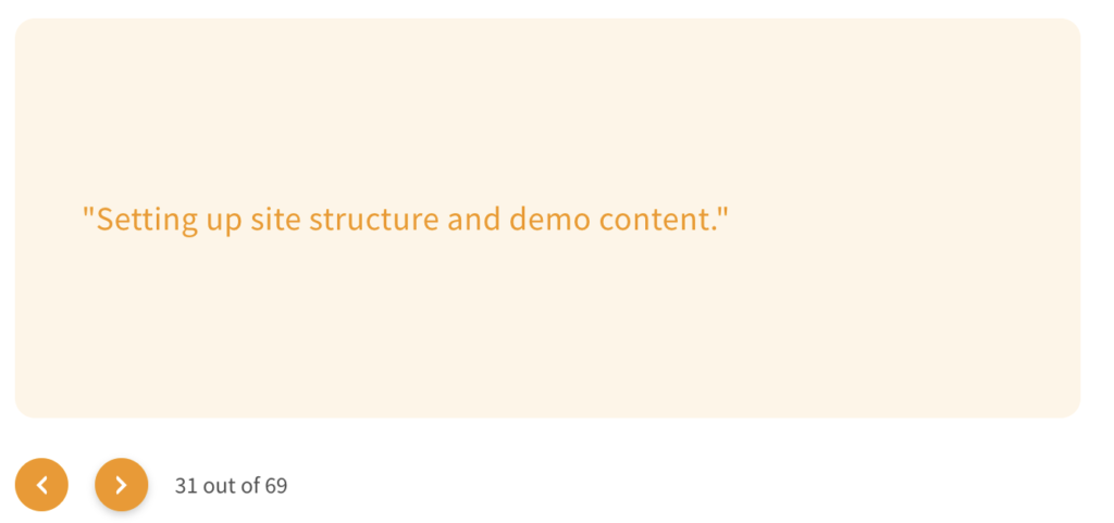
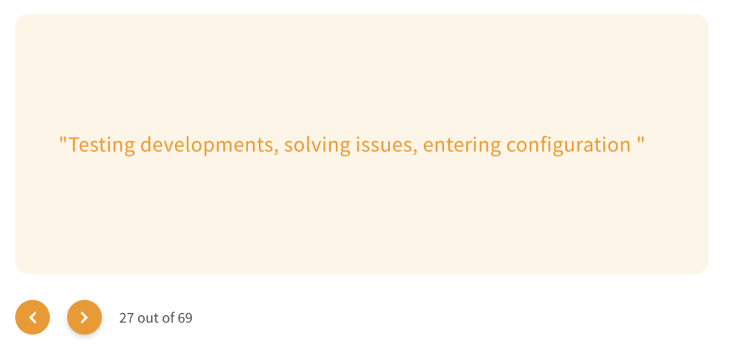
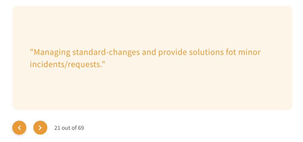
If I cannot ask about the widget, I need to ask about the tasks. If I can statistically organise typical tasks made on the backend I can create ad hoc widget to help that task to be realised.
The question I asked was:
- What do you typically do on the backend?
I asked this question 2 times under a different formulation:
One with a multiple choice to click for a better understanding of the meaning of the question.
One with an open answer to better describe the task.

Based on all those information I created 3 personas:


Persona are made to better understand which kind of user will access the backend, to have a visualisation and a better undestanding for who we do all this work. I find those three are known enough and very suitable for our team. We know them, we know their usual key features, we can imagine why I used them for this purpose. I found this way of the visualisation much more fitting and effective than a fictive name.
Now that we know what we need to do, what the competence is doing and for who we do it we need to focus on how do we want to achieve our goal.
Love at first sight
We should not forget we want to change the overall experience the user will have opening the backend. How the dashboard looks it is a crucial point. The user should love the clear design at first sight (visceral reaction), he should understand it immediately (no demo) and should be pushed to try.
This “Love at first sight” will create expectations. Those expectations need to be trusted and fulfilled (behavioural reaction). The dashboard must work smoothly and the benefit of using it must occur quickly. We do not have much time to get the user “love us”. The user should love the design and understand that the appearance is only serving the functionality.
If the user needs to think on how to use our dashboard or need to understand and learn, we are lost. Time is a very big factor for the success of our tool.
We have been discussing about which design is the best to fit our needs. At the end we decided to use the TYPO3 organisation style guide. It uses a flat clean design with recognisable colours. This will be the basic dashboard variation. In best case there will be an easy customisable option to just adjust some colours to the Corporate Identity of the company the website is designed for.

On the top of the Style Guide I was setting some Design Criteria:
- Red will be very scarcely used and only in case of danger or security matters. We wasn’t to avoid the blindness provoked from too many red elements on the screen.
- The boxes or widget (that are not related to each other) will be separated by clear blank space.
- No overdue or rainbow color. We will keep it simple. The design should serve the function.
- No 3D effects.
- Title text will be explicit: no abbreviation. Abbreviation must be remembered and are not immediately recognised.
- Motion will be used only as supportive reaction to an action. We will avoid every movement that could distract the viewer and deconcentrate his work.
- No scrolling inside a widget.
- No vertical text.
- No pie-charts (too complicated to remember in order to compare data).
- The different widget will follow the Gestalt principle for the pattern and configuration. Proximity — Similarity — Continuity — Connection — Closure — Enclosure.
Additionally to the design I was collecting some basic functions we should have in mind when developing the UI:
- The most important information or a summary of the dashboard should be on the upper left side of the screen. We are following the Z theory.
- In the opposite position, on the lower right, we should find the place to add new widgets. We can create a plus button to symbolize the addition. After clicking on the button, this will open “accordion like” with several widget offer. This plus sign could also be posted inside the last placeholder widget. It will be an empty tab with a plus sign. Each of the new widget included in the accordion popup should have a recognisable icon (6 points) to symbolise the drag and drop function. In the best case we would have a placeholder appearing in the normal screen, to guide the user to drag the new widget in the right position.
- The widget can be rearranged and reorganised by the user. We want the user to recognise the place, situation and meaning. It is much easier than recall and it will enhance the Generation effect — the recall of self-generated informations is greater than just the use of a good design.
- Restrict number of short-term memory items.
- It would be great to menage the dashboard “on the go”.
- What about a TV display option? The dashboard could have a full screen function in order to display the status of the website/company on a big screen.
Widget list
A Dashboard without widget is no dashboard. I see the necessity to provide with three individual dashboard to choose from depending on the persona and their experience on the backend.
The user should still have the possibility to variate his opportunity adding new features. This option should be restricted to the first two personas, leaving the unexperienced Jar Jar out of the option. He should still be able to use the dashboard, but the adjusting option should be given to an editor with more experience.
The core features in most of the dashboards for freecodecamp are:
- Tables
- Notifications
- Tasks Lists
- Cards (for different type of forms and easier visualisation of the information)
- Charts ( line chart, bar chart)
- Google Maps
I was creating a basic list of widget based on all the data collected:
- Content overview: how many pages, News, Users…
- Recent Items: recently modified items and pages by owner.
- System Status:central hub for monitoring health.
- Welcome: Useful links or tutorials to “get started”
- Calendar
- To do tool
- Profile widget
- Analytics Timeline.

Next Steps:
1. Enlarge the list of basic widget.
2. Specify a User Interface.
3. Prepare a prototype and test it with the user.